These two buildings across the street from each other in San Francisco were constructed nearly a century apart, but they both have the same form. Seven story mixed-use built to the sidewalk. The new building may look very different, architecturally speaking, from the old one, but it is identical in form. Often when people argue about compatibility of design in new construction they obsess about architectural style and ignore the form of the buildings. This is something many community "design review boards" miss; especially when it comes to single family homes. It doesn't have to look like a replica of existing buildings to be compatible with the character of the neighborhood.
Showing posts with label Urban Form. Show all posts
Showing posts with label Urban Form. Show all posts
February 20, 2015
January 4, 2015
Decent Urban Form
You might not like the color. You might not like the architecture and you might not like the chain stores, but this is a pretty good project.

This commercial development on Wilshire Boulevard in Los Angeles has a Ross Dress for Less, CVS Pharmacy, and several chain restaurants. Nothing to get too excited about and no "game changing" tenants. The positives of the project are its height and the placement of the
building at the sidewalk and the fact that all the stores have entrances that face the street. I can take or leave the architecture. I'm sure
there's lots to criticize, but at least the facade is broken up a
little and it doesn't look like one massive building (which it is). You can imagine how different this project would look were it built in a traditional suburban style behind a sea of asphalt parking.
The entrance to the parking is aligned with the cross street so although
it's not a real street it is placed in a location that drivers and
pedestrians would expect cars to be entering and exiting.
This is the project looking east. There are awnings and patio dining. My biggest complaint is the lack of shade trees.
August 18, 2014
Downtown Pomona (Post 1 of 3)
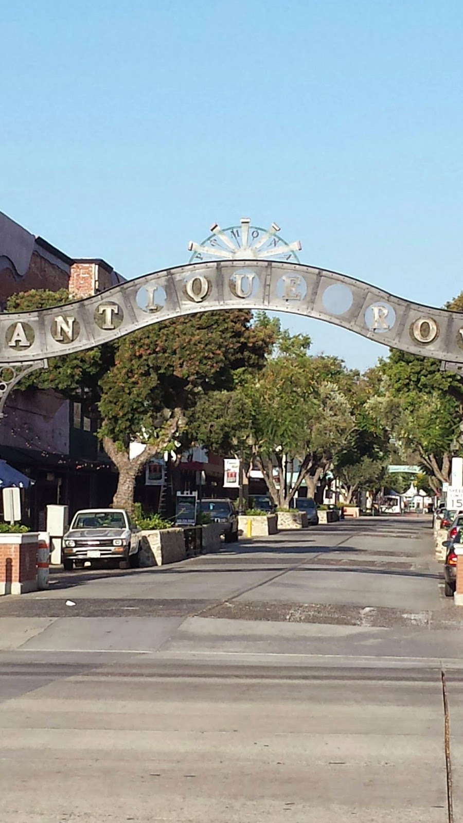
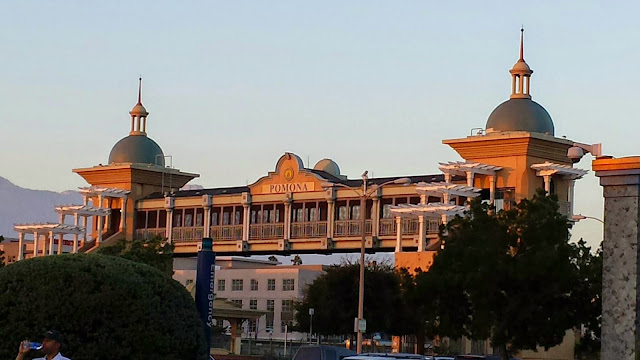
Downtown Pomona has all the basic elements of "new urbanism" which, as I've mentioned in a previous post, is really just old urbanism rediscovered. Downtown Pomona, like many original downtowns in Southern California's "suburbs" provides a case study in how to redesign and retrofit the sprawl that surrounds it. Like many American cities in the 1960s Pomona pedestrianized one of their downtown streets (Second Street) in an attempt to compete with suburban malls. And like most other pedestrian malls, it failed. A couple decades later Pomona, like most of the other cities, reopened Second Street to vehicular traffic. One end of the street is called the Arts Colony and the other is Antique Row. Second Street seems to be the heart of downtown and you can see the great potential in the many old buildings to form the basis of a full fledged revival.
Welcome to downtown Pomona! Sorta...
Arts Colony entry
Arts Colony entry later in the evening.
Second Street. On-street parking, tree-lined, historic buildings built to the sidewalk, and patio dining.

Second Street later in the evening.
The other end of Second Street is Antique Row, which I wish they would drop because it sounds lame. They should consider a name change. "Second Street East"or something like that. Notice that although they've reintroduced vehicular traffic to the street, there are still driveways that signify to visitors that this is a shopping center rather than part an urban setting.
Metrolink Station provides connection to Union Station in downtown Los Angeles. One of the challenges for downtown Pomona is that this is also a freight route so there is a god deal of train noise. I suspect this might be one of the reasons that the residential development is practically non existent.
More on downtown Pomona in the next two posts.
July 23, 2014
Building placement matters.
This the the intersection of Chippewa and Delaware in downtown Buffalo, NY. Look at the difference the proper placement of a building at the sidewalk can make on a neighborhood. Two of the buildings are built to the sidewalk and a third is built like a tacky strip mall. Shame on Starbucks. So desperate to be across the street from a local coffee shop that they choose to lease that hideous building. The building under construction on the fourth corner will be placed at the sidewalk edge as it should be and help make this a vibrant intersection. Perhaps the Starbucks corner will follow suit.
Subscribe to:
Posts (Atom)


