Showing posts with label Streets. Show all posts

August 4, 2021

Haverhill, Massachusetts


Although it's a state route, the street is narrow which slows traffic. On street parking is a physical barrier between pedestrians on the narrow sidewalk and moving cars in the street. This part of Haverill survived the "urban renewal" demolition that affected other parts of town. Three to four story buildings. Built to the front property line. Limited on site parking. Traditional architecture and building materials.  Small town urbanism.

August 12, 2014

Leave the palm trees alone!

Palm trees get a bum wrap these days. People say they don't provide shade, they aren't native to Los Angeles, they use too much water etc. But I think palm trees can sometimes play a role in defining public space and the "outdoor room" on the street and they make good accent trees. And certain types of palms, when clustered together can provide a decent amount of shade. In the example below the enclosed mall does not front on (or interact with) the sidewalk. The palm trees on this block help to make up for that lack of building frontage and provide a comforting sense of enclosure for pedestrians. They also add height and visual interest. It would of course be better if the building opened to the the sidewalk rather than relying on a landscaping band-aid. (Side note: That bus stop blocks the entire sidewalk and should be moved a few feet into the landscaped area.)

July 23, 2014

Building placement matters.

This the the intersection of Chippewa and Delaware in downtown Buffalo, NY.  Look at the difference the proper placement of a building at the sidewalk can make on a neighborhood.  Two of the buildings are built to the sidewalk and a third is built like a tacky strip mall. Shame on Starbucks. So desperate to be across the street from a local coffee shop that they choose to lease that hideous building. The building under construction on the fourth corner will be placed at the sidewalk edge as it should be and help make this a vibrant intersection. Perhaps the Starbucks corner will follow suit.

June 23, 2014

How can we make this underpass better?

This is Westwood Boulevard where Interstate 10 passes over. How can we make this less of a dead zone and more of a community asset? I know there's a movement to remove freeways and replace them with boulevards, but that's not a practical reality for this freeway right now. So we're stuck with underpasses like this one. Just beyond this image is tree-lined Westwood and it is about a five minute walk from the under construction Metro Expo Line.  Murals and lighting have been tried in other places, but what else could be done to mitigate the inhospitable nature of this place? I'm wondering if vertical elements that mimic the trees further up could be part of the solution. They did something like that where the 10 passes over Pico Boulevard. They could provide additional lighting at night and also function to create a buffer between pedestrians and traffic. Bright paint could help as well. Or perhaps a decorative signs announcing the entry to the neighborhood. I wasn't able to find anything beyond artistic lighting and murals online. Have people just accepted that freeway underpasses are ugly and there's not much to be done? Maybe my Google search skills are lacking. 


June 17, 2014

Taming a Stroad

This reconfiguration of Angeleno Avenue in Burbank reduces a four lane stroad to two lanes with a center turn lane and bike lanes. The bike lanes connect the lanes on Third Street to future lanes on First Street, A landscaped median would have been ideal, but there are too many driveways on this street for that to be practical. Good job, Burbank Public Works.


June 16, 2014

If you want to encourage people to walk...

It really doesn't take much. Sometimes it's as simple as keeping the sidewalks level and planting some trees.

June 10, 2014

Does A Place Have To Be Tidy To Be Worth Caring About?

Or are places worth caring about better tended to because people care? The image below  is not the worst, but I'm using it as an example because it is in an area with many popular restaurants and other businesses. The waste running out of the dumpster and the overall unattractiveness of the street don't seem to be detrimental to businesses there.  I often wonder in these situations why the business owners don't take it upon themselves to keep things clean. I have similar questions about the sidewalks along Westwood Boulevard between Santa Monica Boulevard and Wilshire in Los Angeles. They seem to lack any attention to basic cleanliness and the trees have been trimmed down to shrubs, yet there are only  a handful of vacancies and there's plenty of foot traffic. I'm trying to figure out what I;'m missing. Could be as simple as the fact that the demand for the space and the overall economic vitality override the need for order and cleanliness. I suppose urbanism isn't necessarily tidy. In fact some would say it NEEDS to be a little messy.

June 9, 2014

Boulevard as wide as a freeway.

This is the intersection of Santa Monica Boulevard and Westwood Boulevard.  This is what I have to cross to get to the closest grocery store. Ten lanes of traffic. Essentially a freeway with a traffic signal. (The route of the cancelled Beverly Hills Freeway. )

Many pedestrians cross this street with minimal problems every day. It's not the most pleasant experience because you feel very exposed in the middle of the vast intersection.  But there's strength in numbers so if you happen to be crossing one of the times of day when there are large numbers of people it really changes the experience.  There's no easy way to mitigate the massiveness of this boulevard, but on each of the corners there are gas stations,  a car wash, and a one story commercial building. Taller structures built to the corner might be the best way to reduce the feeling of exposure this intersection creates.  I can guess how the Homeowners' Owners Associations would respond to that. 

June 6, 2014

How wide does a street need to be?

This street has been temporarily narrowed for construction,  but it's clear that only half the width is necessary to move the same amount of automobile traffic.

December 26, 2013

Justice Center

The bridge connecting addition parking the site is totally unnecessary on such a quiet street. Such pedestrian bridges make more sense when you need to get large numbers of people across busy streets, but both the number of people and cars here is so few that the bridge is overkill. Then again, the street entrance is so hostile to pedestrians that it's makes sense to help them avoid it and get right to the wind swept plaza above.

November 19, 2013

Visalia Bench

A very clever bench in downtown Visalia, California. There weren't many of these and it looks like part of an older attempt to improve downtown, but it's unique and adds character and I hope they keep it.

October 31, 2013

How to Treat a Corner

These two buildings sit across the street from each other at an intersection in Little Italy, San Diego. One of these buildings has a relationship with the street and sidewalk, it is accessible from the sidewalk, and it brings life to the neighborhood with outdoor dining and a fountain. The office building is walled off from the intersection. There are no entrances on this side of the building except for a garage entry. The mirrored windows prevent even a visual connection to the rest of the neighborhood from either side of the glass. The building on the left seems more likely than the other to contribute to making the neighborhood a place worth a caring about.


October 22, 2013

A Tale of Two Sidewalks

I posted the side by side pictures below on Facebook and asked my friends which neighborhood sidewalk seemed more appealing. The responses reminded me that the aesthetic ideal of an urbanist is not generally how people evaluate a place.  My friends preferred the image on the right which is in West LA, because the pavement is flat and seemed that it would be easier to walk on in (especially in heels). They also liked that the sidewalk on the right is wider and unobstructed and easier to maneuver. One even noted that there were no places for bad people to hide in the more open suburban sidewalk. I argued that the street on the left, which is located in Pittsburgh, was shaded and the narrowness slowed traffic and the cars provide a safety buffer for pedestrians - all the stuff we planners love to talk about - and they didn't buy it. I suppose you could improve the sidewalk on the left by paving it properly, but that wouldn't really get at the bigger issue which is that the the image on the right more closely reflects what most people are familiar with and is more suitable for their lifestyles so they can imagine themselves walking down that sidewalk whereas with the Pittsburgh sidewalk they have a difficult time seeing themselves in that environment.

Which of these neighborhoods is more appealing to you?


September 17, 2013

Does Art Like This Make A Place Worth Caring About?

Wall painting in underway in downtown Los Angeles.
Art like this can add visual interest and entertain. There were people standing across the street watching the artist as I was. That points to the temporary effects this has on a place, but will people stop across the street and linger to look at this when it is finished? Perhaps. It will more likely become part of the "feel" of the neighborhood. One of those things that pleases people and that they would notice and miss it if it were gone.

September 10, 2013

Allowing Charming Places To Exist

Narrow, tree-lined street. Quiet dining patio that provides you with a reason to be out among other people. A place to see other people and be seen. A warm day but the trees filter the sun light and make for a pleasant Sunday brunch.
Baldwin Street, Toronto
This street is lined with restaurants like this.  There was no noticeable off street parking for these businesses although there are some lots tucked away nearby that may or not may not be available for these businesses. There is limited parking on this narrow street. I walked there as I imagine most others did. In many cities these old commercial spaces could not be used for restaurants because of parking requirements. The parking requirement would also likely apply to the patio area. Your city's zoning codes explicitly prevent these sorts of places.  What we end up with instead are restaurants and shops set back from the street and surrounded by a sea of depressing,  hot pavement.

August 29, 2013

Random Seating

One of the things that they teach you in planning school is that seating in public spaces should be moveable. People should be free to drag a chair to the shade or to the sun or up to a table where friends are sitting. This fellow decided the Starbucks patio wasn't to his liking so me moved a chair to this sunnier, grassier location. (I've seen this fellow do this on more than one occaision.)  Does this feel awkward when you see it?  What if there were several other people doing the same thing? 
 
What if the trees were kept, the grass paved, and then many tables, chairs, and umbrellas were placed in the parkway? That seems more appropriately urban for this parkway along busy Westwood Boulevard in Los Angeles.


August 22, 2013

Needs More People

This is Spring Street in downtown Los Angeles. The picture was taken in late afternoon a week or so ago. Like most areas of Downtown LA the blocks are hit or miss as far activity goes. On this particular block there are a dozen or so businesses with outdoor seating that brings some vitality to the neighborhood. On the left you can see one of several "parklets" on this block. It is intended to expand the "public realm," but what I observed is that it served the customers of the businesses and wasn't really a place that residents or visitors might chose to simply hang out. I'm not sure how I feel about the parklet phenomenon. Seems a little gimmicky. On the right you can see a car peaking out of a driveway which of course poses some problems relative to pedestrian safety. The only real issue I see here besides the need for more people is the mid-block driveway.

What do you think about this scene? Does it appeal to you? Would you like to walk down this street or sit at one of these cafes?

August 3, 2013

Veteran Avenue

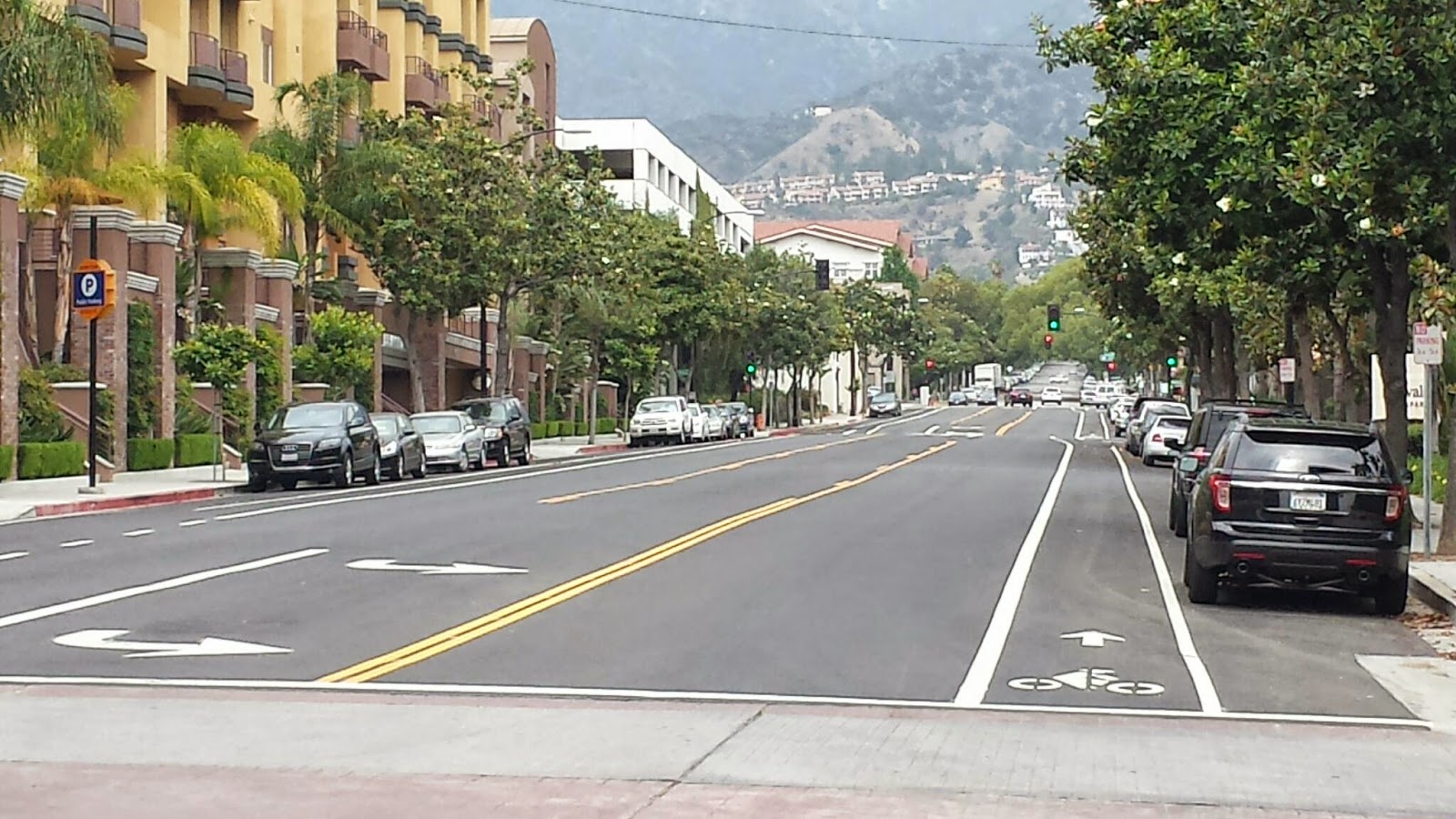
The street plan for Veteran Avenue in West LA is/was that it would be widened to the width you see here. Dedication of land is required as new construction takes place. This results in the inconsistent street width shown here. (I'm sure this silliness is being addressed in the update to the city's Mobility Element.)


Where the street is only partly widened the city has painted stripes to delineate the path of travel (below).  What is the widening accomplishing? Had the street been left at its original width there would still be room for cars parked on one side and one lane of traffic in each direction, which is the situation just south of this intersection, but such a wide street practically begs people to speed. Which they do.


This is the single family neighborhood immediately south of the pictures above at which point widening becomes impossible without taking the front yards of homes. So, then, why widen Veteran immediately north of this neighborhood?


The LA's updated Mobility Element should call for this widening to be undone. Rather than unnecessarily wide streets in residential areas we could end up with wide, shaded parkways, and sidewalks.

Do you see any reason to widen a street that is residential along nearly its entire length?